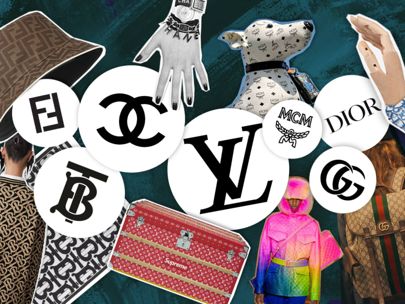
Do you know what these fashion logos stand for? The stories behind Louis Vuitton, Chanel, Gucci, Dior and more
Essential reading for avid logomania fans.
(Art: Jasper Loh)
Can you easily spot and distinguish from afar Louis Vuitton’s monogram from that of MCM’s? The ability to identify most fashion logos is a good start but that doesn’t doesn't automatically qualify you as a style connoisseur.
To really shine and take your style punditry to the next level, you need to really know the essential stuff. Here's a crash course on how the world's most talked-about fashion logos came about and their significance.
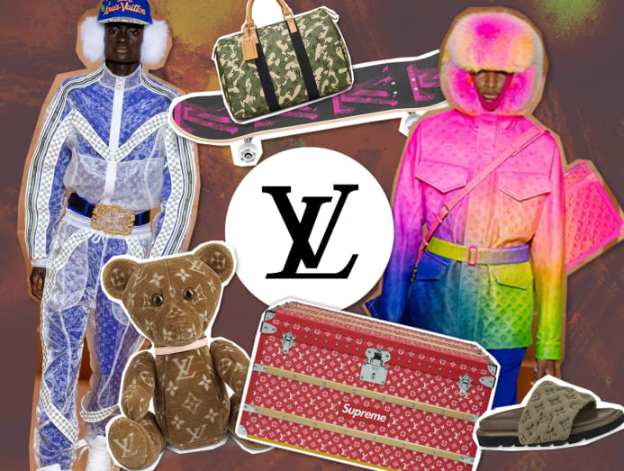
The house of Louis Vuitton may have started in 1854 but it wasn’t until 1896 when the world-renowned monogram came about. Imagined by founder Louis Vuitton’s son Georges, the interlocking initials of L and V were used as an ode to his father. Going a step further, he included auspicious floral motifs: A four-point star that symbolised fortune, a four-petal flower that was believed to attract joy, and a four-point star inside a diamond that signifies passion.
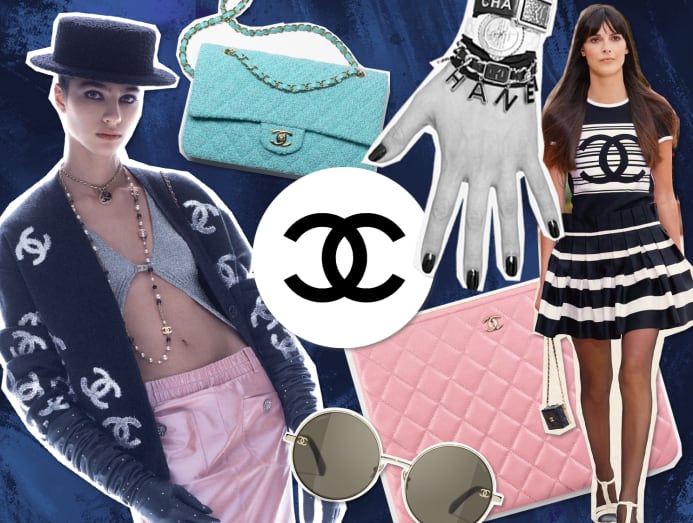
You may know the name of every Chanel bag by heart but do you know how the double C logo came about? Hint: It has nothing to do with Mademoiselle Gabrielle Chanel's pet name Coco.
According to the luxury fashion house, she designed the interlocking Cs as a nod to the monastery in Aubazine, France, where she spent most of her childhood. The geometric pattern of the stain glass windows at the chapel provided inspiration to the couturier to mirror and intertwine the double Cs.
MCM

Avid MCM fans know the acronym refers to its founder, Michael Cromer Munich. However, after the brand was absorbed by Korean fashion retail conglomerate Sungjoo Group, Cromer got scrubbed out and MCM took on new meaning: The fashion group’s ideal of “Modern Creation Munich.”
What remained unchanged is the hand-drawn logo of laurel leaves tied together with a ribbon, which is an homage to King Ludwig I and his (and Munich’s) passion for neoclassicism. The logo is part of MCM’s trademark Visetos motif, which comprises the logo and a diamond inspired by the lozenges found in the Bavarian flag. From its inception, the Visetos appears in black on a cognac base.
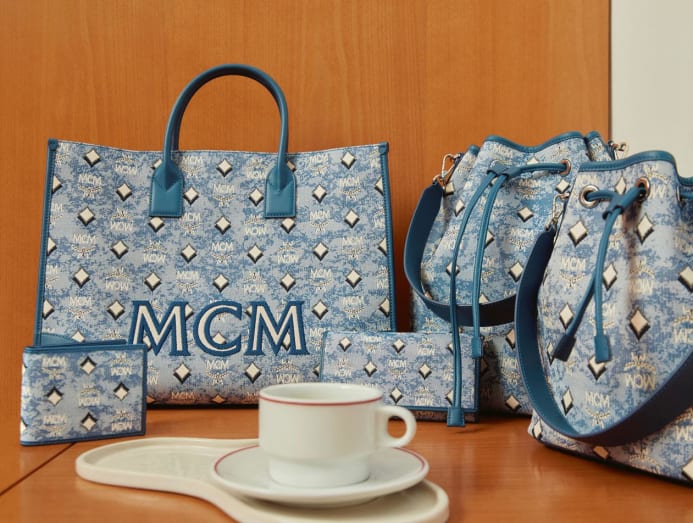
To mark MCM's 45th anniversary in 2021, the brand unveiled a new monogram: A vintage take on its Visetos print using a weaving technique popularised by the Bauhaus Textile School. The MCM Vintage Jacquard Monogram is created in three colourways: Antique grey, modern blue and royal red.
FENDI

The Italian powerhouse may have been founded in Rome by Adele Casagrande and Edoardo Fendi back in 1925, but it was Karl Lagerfeld who was behind the unmistakable double F logo decades later.
When he joined the Fendi fold in 1965, Lagerfeld wanted to get the world acquainted with Fendi’s impeccable fur heritage. So those double Fs stand for "fun fur".
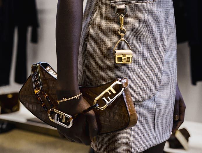
Reportedly, the Kaiser came up with the FF logo in under five seconds during his first meeting with the Fendi sisters. Fur may have fallen out of favour but that hasn’t put a dent on the appeal of the logo which has gone on to become synonymous with the Italian fashion label.
DIOR
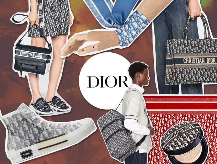
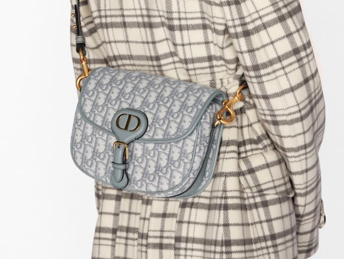
Surprise, surprise – it wasn’t founder Christian Dior who came up with the monogram for the house, but French fashion designer Marc Bohan. Bohan took over the design reins from Yves Saint Laurent who succeeded Dior after his death.
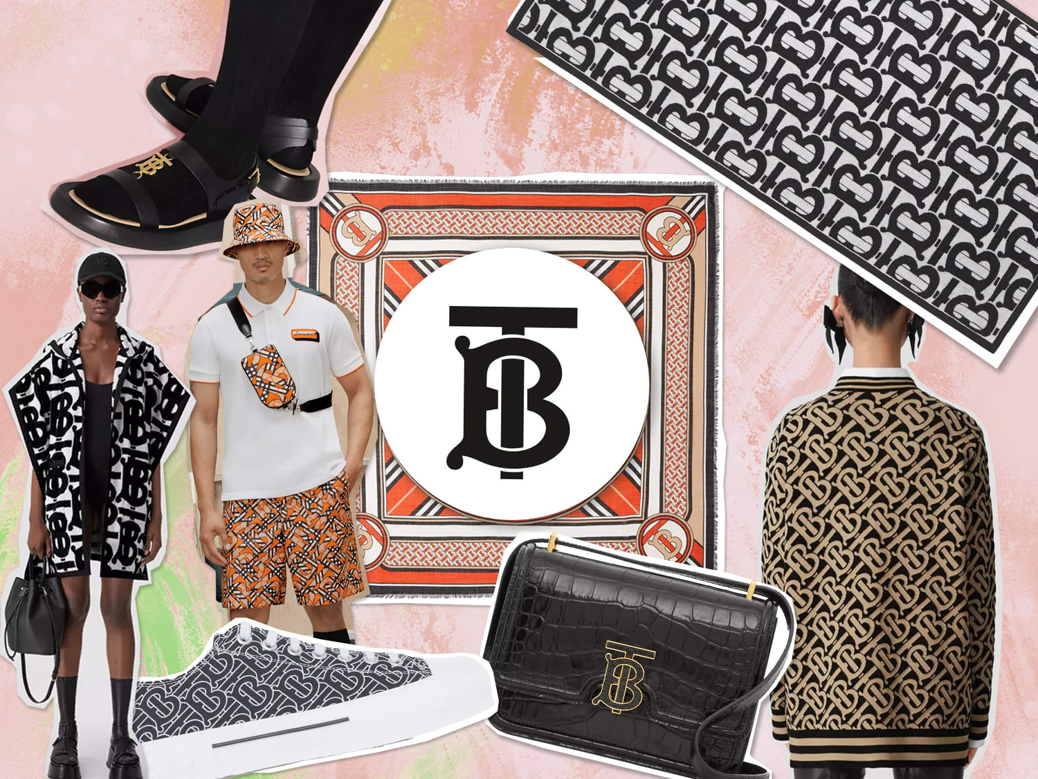
The year was 1856. A 21-year-old Thomas Burberry made it his business to create clothing to protect people from the cold and wet English weather. And for more than 160 years, an equestrian knight became the brand's identifying imagery.
Fast forward to 2019. Chief creative officer Riccardo Tisci tapped art director-graphic designer Peter Saville (who was responsible for revitalising Calvin Klein’s logo with fashion maestro Raf Simons) to come up with a monogram logo that would best represent the British establishment in the new era.
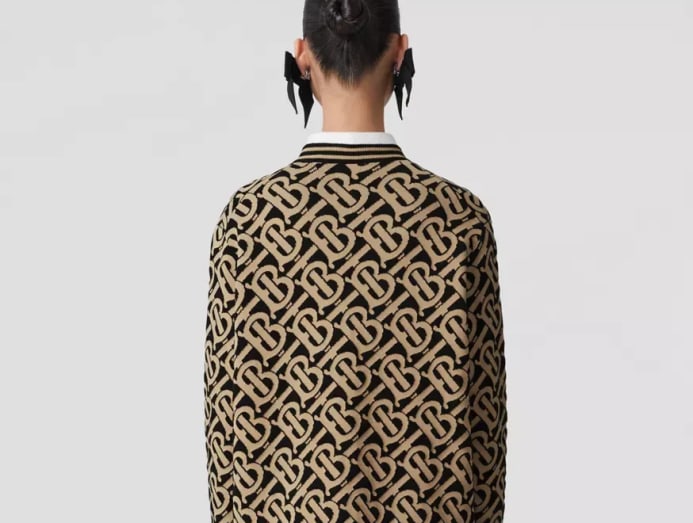
Combining a reminiscent nod to Burberry’s signature beige plaid with a clever play on the founder’s initials of TB, Saville, together with Tisci, created a new house code. Watch this space to see how incoming artistic director Daniel Lee puts his spin on the logo.
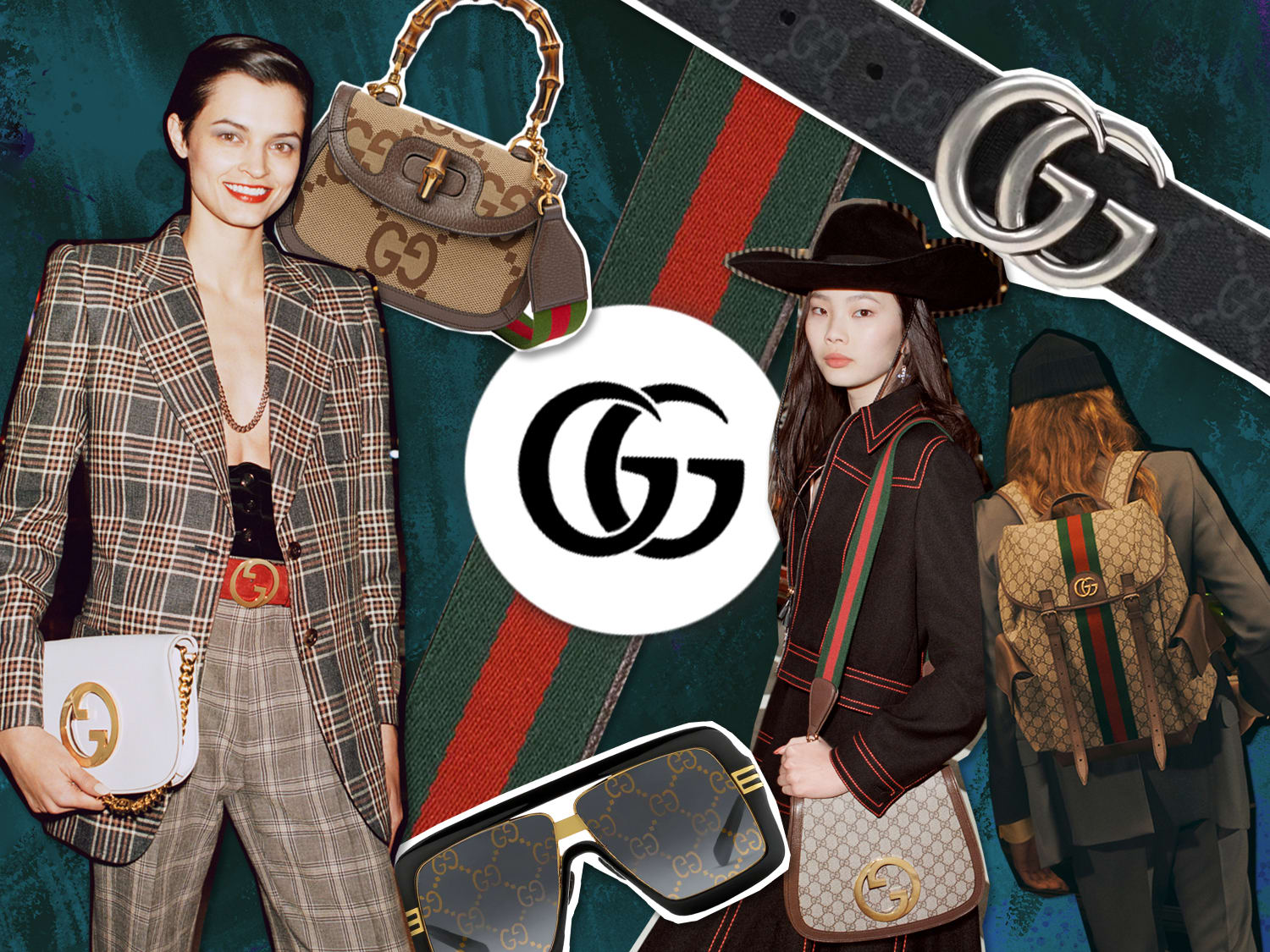
You guessed it – the GG logo has to do with its founder Guccio Gucci. His three sons wanted to pay homage to their creative father. Together, they decided that there’s no better way to do so than to put a spin on his initials.
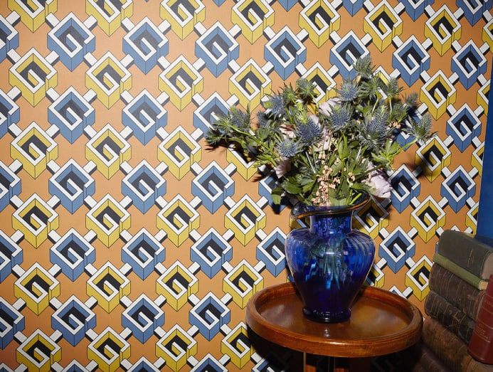
Over the years, the logo has been reinterpreted in many ways: The right way up, upside down, as a monogram of two Gs repeated ad infinitum, as angular Gs (under Tom Ford’s watch) and both Gs facing the same way (under Alessandro Michele).


